Revamping UX for Africa's #1 real estate platform
Scope
Website redesign
Role
UX/UI designer
Overview
For over 35 years, Addoha Group has been a key player in real estate development, delivering nearly 280,000 homes in Morocco and actively expanding across Africa. With over 135,000 units in development, the group partners with governments in Côte d’Ivoire, Senegal, Guinea Conakry, Ghana, and Togo, bringing its expertise to drive housing solutions across the continent.
Brought to the table :
✦ User flow
✦ Wireframes
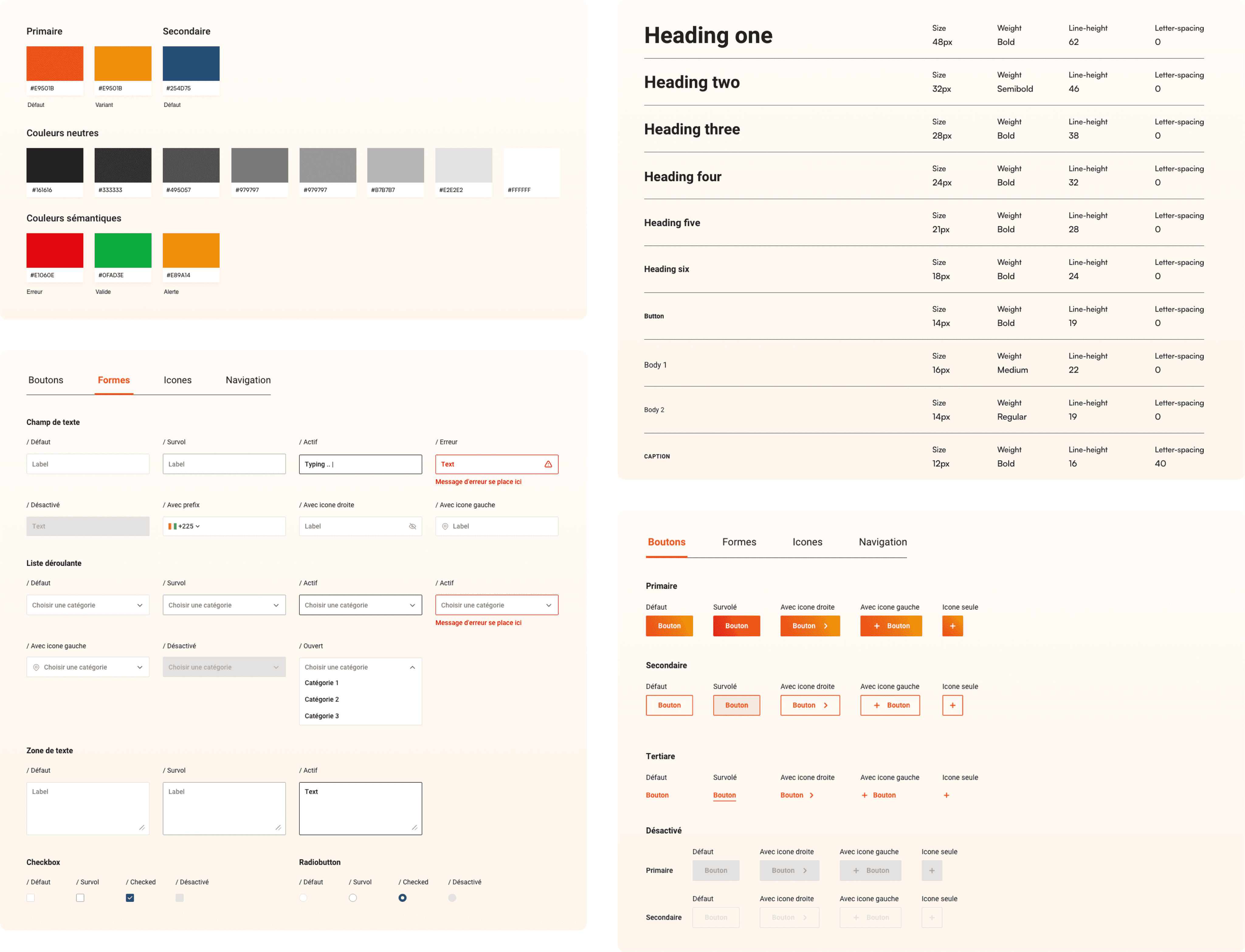
✦ Design kit
✦ UX UI design
✦ Prototyping
Disclaimer: This project was conducted in French and Arabic. Most of the screenshots are in French . If you need additional context, feel free to reach out.
Problem
The client highlighted that users were struggling to find informations they needed in the website. Additionally, the booking process was described as confusing, with a disjointed flow and unappealing visual design, leading to a frustrating user experience.
Goals
Simplified navigation, an enhanced booking experience, a boosted online presence, and elevated visual appeal were key goals aimed at addressing users’ pain points and strengthening the online presence of Africa’s real estate leader.
Challenges
One of the major challenges was understanding the real estate domain to determine how users prioritize and interact with property information. Through research, exploration, and collaboration with the client’s expertise, we were able to structure the hierarchy to make critical details easy to find without overwhelming the user.
Analyzing the existence
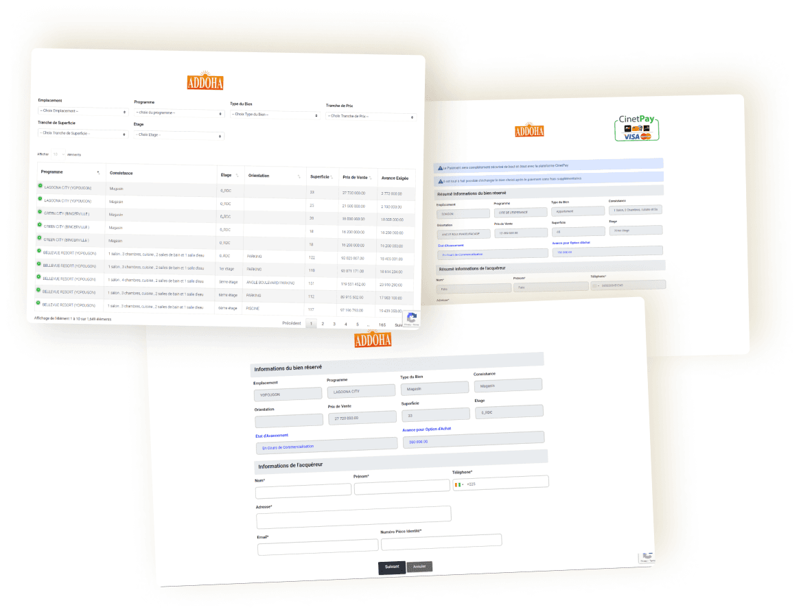
From the start, it was evident that the current booking flow and website had significant usability issues. To address these effectively, we first conducted a workshop to understand the business goals and uncover additional client concerns . The key issues included a properties list displayed as a data table which was not user-friendly—particularly on mobile. The form was unnecessarily duplicated on another screen and disabled, adding confusion. There was also no clear indication of the current pages, the buttons lacked hierarchy appearing as primary actions and other observations.. These challenges highlighted the urgent need for a complete redesign.
Before/After booking flow
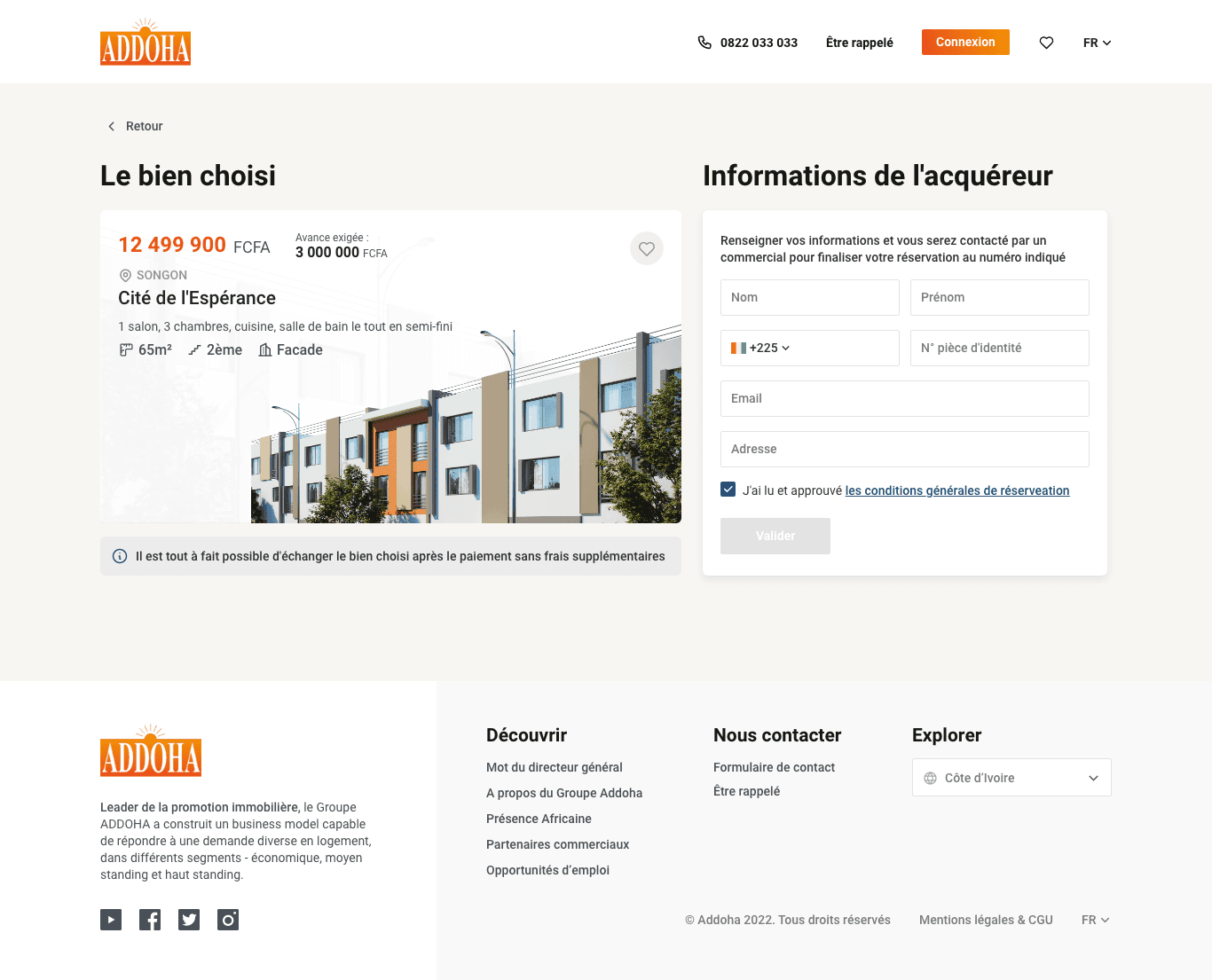
The booking flow needed a thorough review to improve usablity, reduce user confusion, provide all needed and optional informations, minimize the number of clicks needed to book a listing, and incorporate the brand identity across the booking screens. While I can't cover every detail, here are the key points:
Before
— Interested visitors can book a property tour from the website, but not from the homepage, they have to open an external page called Index page accessed via the home page and filter and search.
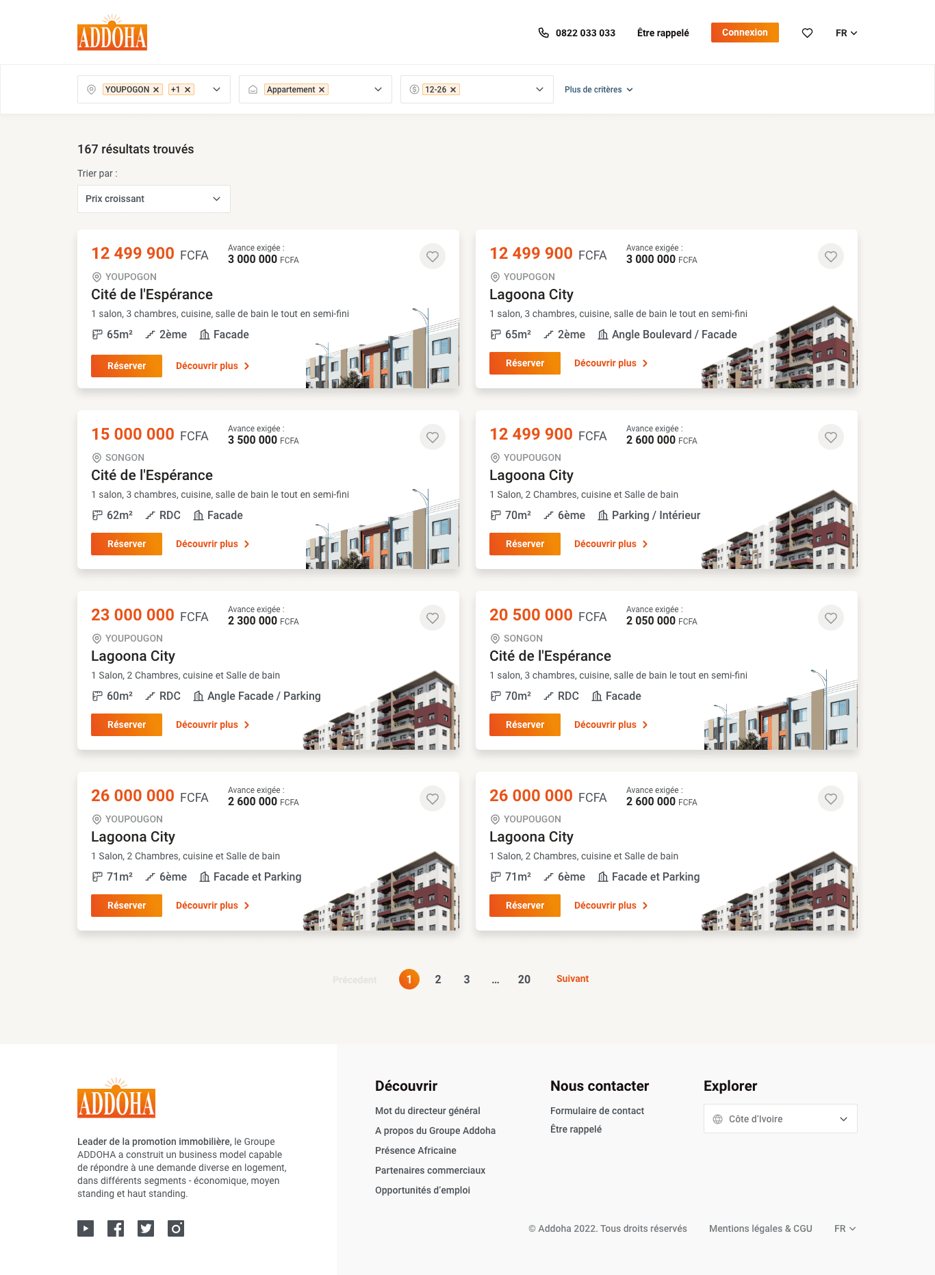
— Both listings and all filter are explicitly displayed on the same index page of listings, lacking a clear hierarchy and visuals of listings, This made it difficult for users to find property details.
— The website covered multiple African countries, each with different listings and prices. However users couldn't select their country upfront. All listings are displayed regardless of location, and users only entered their country on the payment page.. quite confusing!
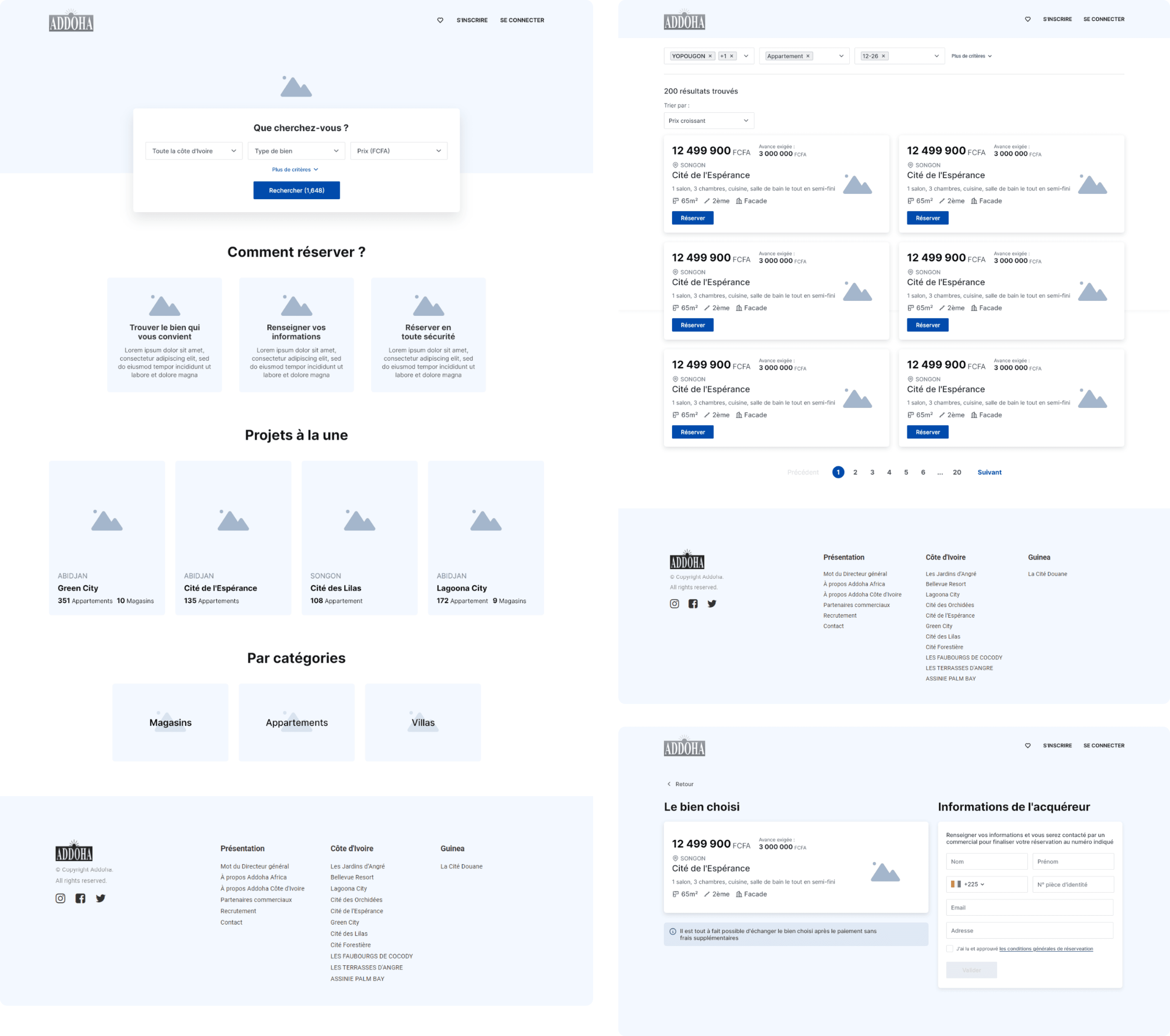
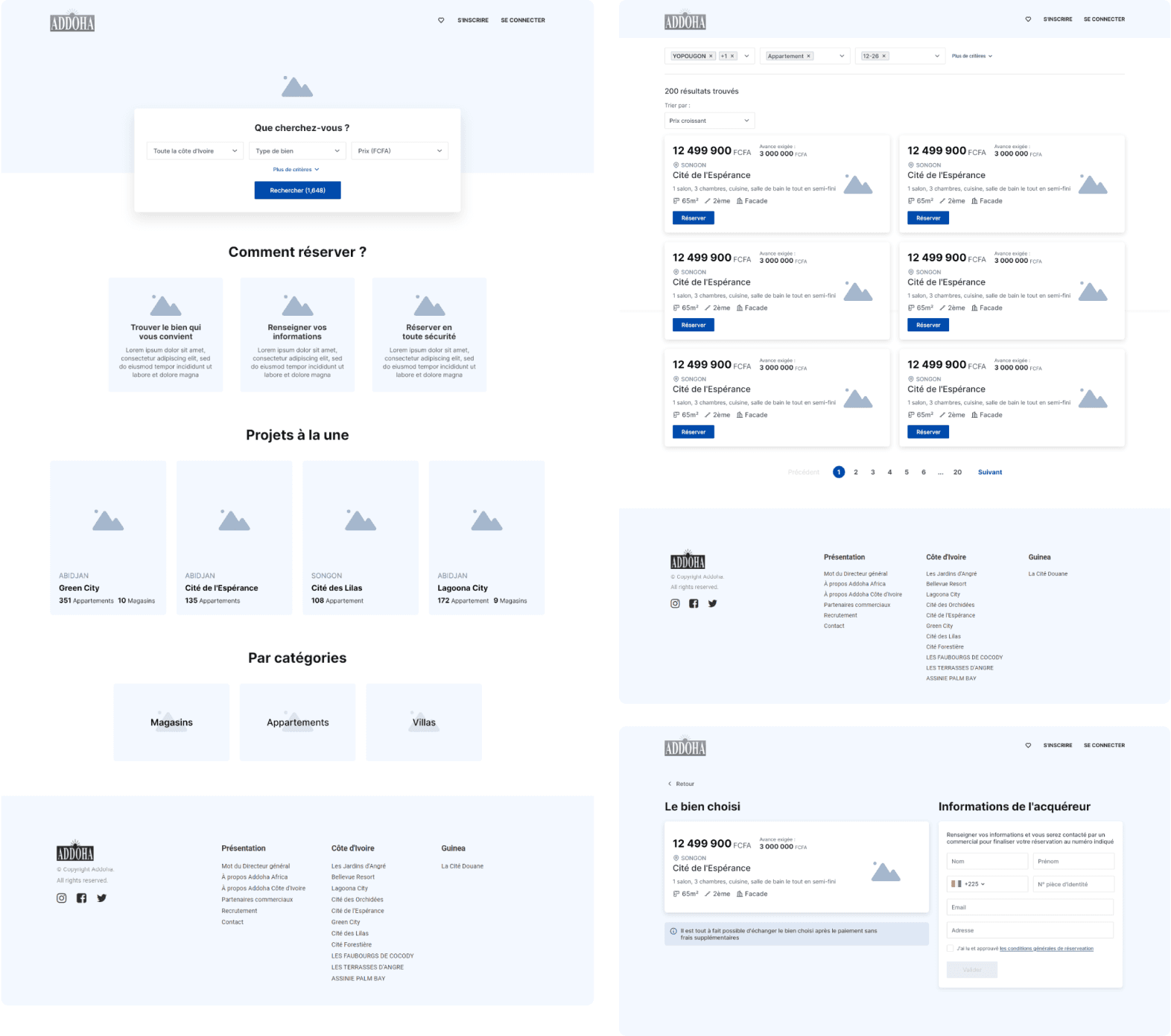
After
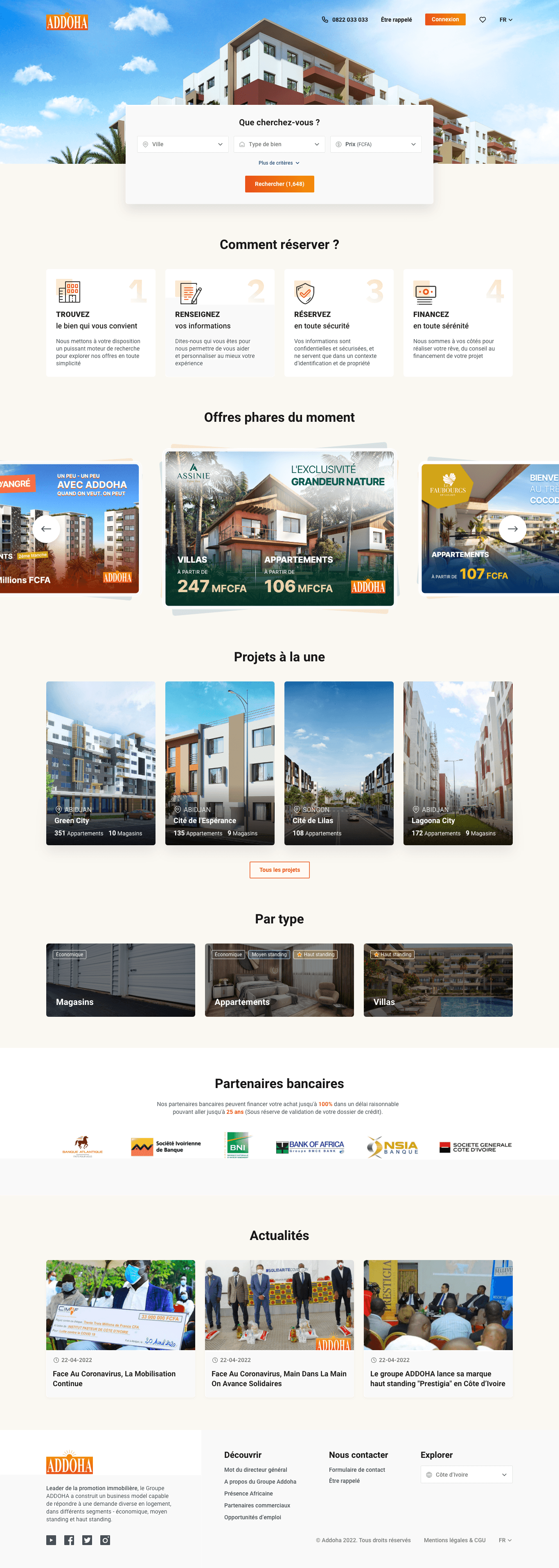
— The homepage now has a hero section with a search engine and ordered filters by priority.. allowing visitors to search for properties directly upon landing, without having to search for where to start and go to another page.
— A complete overhaul of the listings with a clear information hierarchy, engaging visuals, and prominent, user-friendly CTAs to guide actions effectively.
— Upon landing, users select their country, with the flexibility to change it anytime via the navbar. Listings and prices dynamically update to reflect the selected country, which is clearly displayed at the top of the page
To the fun part
All together
We intentionally focused on simplicity and clarity, eliminating unnecessary elements in the design to keep users engaged with what truly matters: Content
What if we only have 1 project for this country? and 10 for another
With diverse country listings, we had to account for all possible variations in projects and project types
No zoom or pinch needed.
It’s mobile-friendly
Thanks to the improvements the team implemented, revenue grew by 55% in 2023 compared to last year, the booking error rate decreased by 60%, and user engagement significantly improved through better navigation and a streamlined booking flow, which leads to higher conversions of booking tours.
While I’m very satisfied with the final result, there’s always room for growth. If I were to further optimize the project, I would :
Conduct usability testing for the booking flow with real users.
Deepen my knowledge of the real estate domain to understand what truly engages visitors to book a tour and eventually buy a property.
Add a newsletter feature to keep users informed about new property listings, special promotions, etc. to get more engagement.
Perform a detailed competitive analysis to identify gaps and develop a strategic plan to make the website stand out.
Review and refine the copywriting, ensuring it resonates with users by testing it
