Boosting the financial wellness for employees
Scope
Responsive web app
Role
Product designer
Duration
6 months
Team
2 engineers, CEO, 1 operations, 1 designer
Overview
PayLik is a financial benefits management solution for companies & startups. It enables employers to simplify and automate the process of requesting a salary advance, expense management, and other perks, providing employees with instant and secure access to their funds via a prepaid card.
Disclaimer: This project was conducted in French and Arabic. Most of the screenshots are in French . If you need additional context, feel free to reach out.
Goals
❋ Reduce walkthrough time per user
❋ Reduce usability-related support tickets by at least 30%
❋ Reduce usability-related support tickets.
❋ Build and scale multiple features
❋ Establish a scalable design system that is consistent across all user types
Problem
Despite offering essential financial services, PayLik users (both employees and HR teams) faced operational friction and frustration due to difficult-to-use workflows and a lack of essential features. Employees essentially struggled to complete core actions, while HR teams lacked clear oversight, control, and the ability to efficiently complete their own responsibilities.
This led to a growing number of usability-related complaints, heavy reliance on guided walkthroughs to understand key flows, low adoption of key features, poor task completion rates, and limited client acquisition. Over time, these inefficiencies eroded user trust, hindered scalability, and ultimately impacted growth and retention.
Constraints
1/ Brutal deadline: We had a lot (I mean a lot!) on the table to build within a deadline that felt impossible at the beginning. We were compelled to adapt, sometimes skipping steps to stay on track.
2/ Designing for 3 distinct user groups: it’s a requirement that felt quite challenging: building a coherent, consistent experience for 3 distinct groups: Employee, HR, and Admin, while requiring prioritizing the mobile view for employees and the web view for HR teams.
3/ Lack of feature prioritization: we had over 30 features to ship that required multiple iterations and testing, without any order or priority.
Collaboration
We created a WhatsApp group for sprint updates, lightweight feedback, and exchanging ideas. For more important discussions like features explanations, requirement clarifications, or in-depth design reviews, we held regular Google Meet sessions every 10 days and added extra meetings when needed. To ensure faster and smoother implementation, I collaborated directly with the front-end developer via 1:1 WhatsApp chats to quickly adjust/modify designs and clarify instructions that weren’t documented in the Figma file.
Coming soon
Coming soon
Coming soon
“It took us over 30 minutes to explain to an HR how to use the expense management feature”
Paylik team
Research
1/ User interviews & support tickets
Since the MVP launch, the team has conducted continuous research through user interviews and support ticket analysis with both employees and HR teams across multiple companies. Nearly all of PayLik’s client companies reported consistent findings, revealing the following:
Key findings:
Users frequently complained about confusing navigation, unintuitive interfaces, unclear labels, and hard-to-find actions.
Both employees and HRs often relied on manual guidance to complete tasks, frequently reaching out to support.
HRs lacked a synchronized way to track and approve employee financial requests, especially salary advance requests, making processes slow and inconsistent.
Over 90% of users in both groups expressed a strong need for essential HR-financial features such as mission orders, expense tracking, bonus distribution, and employee management.
2/ Personal thinking
After gaining a clearer understanding of the research findings and the target audience, I took a critical approach to dig deeper into the pain points. I challenged the given findings and questioned whether they extended beyond usability issues alone. During a solo brainstorming session after the discovery call, I went beyond what the team already found, and some of the key questions I came up with were:
“Do all our users actually understand French (the app’s default language”)
“Are we assuming employees use laptops to execute their tasks, when many might not even own one due to economic limitations?”
“If walkthroughs are already part of onboarding, why are users still reaching out for help later?”
I brought these questions back to the team, and they completely agreed. Many employees in some of our key target companies don’t speak French fluently and would clearly benefit from having Arabic as a language option. They also acknowledged that not all employees have regular access to laptops and rely mostly on their mobile phones for daily tasks. And yes, even after a walkthrough, users still struggled to navigate the app. The interface wasn’t intuitive enough, many didn’t know where to click or what to do next, and critical actions remained unclear.
3/ Audit confirmation
Alongside these findings, I conducted a full audit of the existing product to experience it firsthand. It quickly became clear that major usability issues were baked into the platform. These flaws explained why even after guided walkthroughs, users struggled to complete basic tasks.
Insights:
Users lacked autonomy: without intuitive and usable interfaces, users depended on support to understand and complete their tasks.
HR teams needed better visibility: The lack of a clear system for approvals and financial workflows made processes inefficient and slow.
Discoverability was poor: hidden actions and inconsistent language reduced task success and increased support requests.
Missing key features blocked adoption: without the basic tools HR teams expected, usage remained limited and fragmented.
Solution at glance
Before jumping into pixels, I focused on solving the root causes of abandonment: high setup friction, unclear immediate value, and confusing core flows. Each solution was designed to remove blockers (both cognitive and emotional), simplify key actions, and help users feel early progress. Here are the solutions at a glance:
1/ Structured navigation & feature prioritization: I started by mapping features using a value/effort matrix, then grouped them into 6 logical categories based on user mental models. This became the foundation for a sidebar navigation (for HR/Admin) and a mobile-first collapsible layout (for Employees).
2/ Reduced reliance on support: I anticipated edge cases early, asked plenty of questions, and applied Jakob’s Law at its core to build around familiar mental models. I reused patterns from banking apps most Moroccan employees already use, and avoided possible confusion with explicit labels on universal icons.
3/ Improved financial adoption: I mirrored UI patterns and flows from popular Moroccan banking apps for features like top-ups and bill payments, ensuring intuitive navigation by leveraging users’ existing familiarity.
4/ Real-time visibility for HR teams: I built detailed data tables and dashboards to track and manage expenses, bonuses, salary advances, and mission orders (designed to handle various edge cases, such as long names or bulk employee lists). We also added a real-time notification system to flag urgent actions.
5/ Roadmap contribution: Beyond design, I shaped the product roadmap with the team. One of the features I introduced was “Saved Bonuses,” allowing HR teams to store and reuse bonus setups without repeating manual steps.
6/Mobile-first UX for employees: Knowing most employees rely on phones, I crafted a native-like experience using card-based layouts, collapsible menus, and tap-friendly interactions.
Coming soon
Ideation
Unfortunately… we didn’t spend as much time on ideation as we typically would before moving to UI. Instead, we focused on getting the foundations right and did most of the brainstorming directly during the design phase.
To move efficiently while still thinking critically, I adapted my approach. I relied on rapid solo brainstorming sessions supported by the research insights I had. Fortunately, the team was open to letting go of the old app and starting from scratch, freeing me from having to inherit and iterate on legacy designs. I used rough, rapid sketches and user flows when needed before moving to UI, and I stayed close to the engineering team during this phase sharing early screens to validate feasibility in real time.
Design
Coming soon
1/ Started with structure: navigation & prioritization
With over 30 features to design and ship, I knew things could quickly become messy. The first critical step was to bring structure to limit the possible chaos. I began by using a value/effort matrix to prioritize features and ensure the most impactful and feasible ones were tackled first.
Next, I worked on the information hierarchy, grouping related features under clear labels and organizing them into a logical sidebar structure. This helped reduce average task completion time by 30% and made navigation intuitive for all user types. To do that, I:
1.1 Grouped the features into 6 logical categories based on user mental models and re-ordered each feature based on task priority and usage frequency (which I knew from discussions with the team)
1.2 Ensured a web-focused sidebar for HR/Admin users and mobile-optimized view with bottom navigation and collapsible menu for employees.
1.3 Used collapsible sections and smart defaults to reduce cognitive load
2/ Reduce reliance on support
To reduce user dependence on support teams, beyond just improving usability, hierarchy, and polished UI, I focused on:
✦ Making sure to collect all relevant information, catch use cases, and potential edge cases early on by spamming the team with questions like: ‘what if the user doesn’t have this detail? is there a maximum of requests per month/week?…’
✦ Applied Jakob’s law at its core: I leaned into established mental models and avoided reinventing the wheel. I relied on famous UI patterns (like tab bars, accordions..) that users already recognize, with clear labels, consistent element positions, and easy-to-find CTAs.
✦ Explicitly adding labels next to universal icons that will be used frequently, for instance ’Close menu’ label instead of only showing the icon ‘X’. This covers the percentage of people who might not be familiar with universal icon meanings.
Additionally, as part of the initial problem of people relying on support for usability and ‘how to execute tasks, I designed a Full RTL (right-to-left) layout to support Arabic language with the option to change it from the user’s profile.
Coming soon
Coming soon
3/ Improved adoption
I noticed that the financial features (like top-ups and bill payments) PayLik was struggling to get users to adopt serve the exact same purpose as those found in Moroccan banking apps. Since most employees already use those apps daily, I mirrored their flows and UI patterns, making only minor adjustments when absolutely necessary. This allowed users to navigate intuitively without having to learn new behaviors from scratch.
4/ Clear oversight for HR teams
I designed full tracking and management capabilities across all key financial operations (e.g. expenses, bonuses, salary advances, and mission orders) ****while accounting for every possible use case and approval flow. For example:
✦ When designing the expenses table, I considered all possible statuses, long user names, etc.
✦ When designing bonus creation, I considered if the company has 10 employees and +100 employees, and consider a pagination or scrollable section etc..
But we didn’t stop there.. for a much better visibility, the team suggested to add a real-time notification system to alert HR teams when action is needed. This became especially critical for flows that can require immediate attention like mission orders.
Coming soon
Coming soon
5/ Roadmap & feature definition
As the product designer on this project, I also contributed to the roadmap and feature definition. Based on my product experience, I could tell the need for key elements like filters on dense screens and immediate file previews without requiring downloads, etc.
In addition to suggesting the Arabic language support, one particularly valuable feature I introduced was the ability to save previously sent bonuses. When an HR manager submits a bonus request to the admin for approval, they can save the entire bonus setup (selected employees, amount per employee, etc.) to a list called “Saved Bonuses.” The following year, they can simply select it from the list and resend it, without recreating it from scratch. I knew this would be especially useful, as many companies regularly offer the same bonuses.
6/ Mobile-first for employees
If we ask you to journal your entire last year right now, you’ll immediately resist or reject the idea, but if I ask you to only write 2 lines about yourself 1 week ago, its hard to say no, because its not a heavy task.
That’s the approach I adopted when asking first-time users to add their stock during the onboarding. Rather than asking to enter their entire product catalog with full details, we give the choice to start by adding only 1, 3, 5 or 10 products. And not just that, instead of asking for all product details (SKU, buying price, category, image, etc..) we only ask for the product name, selling price and quantity (if you have)
Prototyping
I designed and prototyped most of the flows in Figma: web for HR/Admin and mobile for Employees, covering over 200 screens.
✦ Interactions used: Smart-animate, instant transitions, and overflow scrolling where applicable.
✦ States covered: Loading, empty, error, expanded cards, popups, progress indicators, and toast messages.
✦ Protoyping: Clickable Figma prototypes shared with the team for internal feedback.
✦ Iteration method: Fast internal loops using recorded walkthrough videos or direct WhatsApp replies for faster refinement.
Visual design
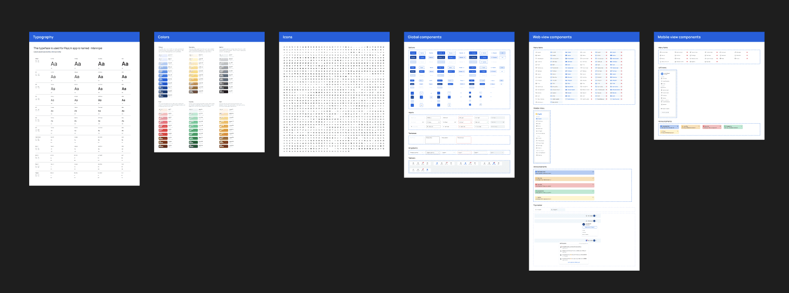
✦ A scalable, consistent design system: With over a hundred screens estimated to design, I started by building a robust and scalable design system that ensured consistency across all user roles (Employee, HR, Admin). The system covered core elements like buttons, inputs, dropdowns, tabs, navigation, chips, and tables designed to adapt seamlessly across web and mobile, with variants for different sizes (e.g., medium and small buttons, compact tabs, etc.).
✦ Visual look & feel: We aimed for a design language that balances trust and approachability.Rounded icons, soft corner radii, and a color hierarchy led by blue (over yellow) contributed to a modern, professional, and reassuring visual identity.
✦ Personalized yet consistent: Since HRs are also employees in the system, they can switch roles within the interface. It was critical to visually differentiate each role’s view while maintaining a unified experience, so users always know which mode they’re in and what actions are available.
Testing
Because the design sprint was moving very fast, the PayLik team ran moderated usability tests with a few target-profile participants (employees and HRs). They focused on the newest and most complex flows to measure completion rate, error rate, and time-on-task.
It wasn’t expected! (just like in any project) you get questions about things you thought would be obvious for users! During testing, we uncovered insights we didn’t expect.
One of the platform’s key Employee/HR functions is Expense Management. Here’s how it works:
1/ The employee submits a Mission order (Ordre de Mission) to HR for initial approval.
2/ Once approved, the employee can add their expenses and send them to HR for final approval.
3/ After final approval, the employee becomes eligible for reimbursement.
From the interface, the employee can add expenses separately and assign them to a mission order (Ordre de mission). They can then go to the ‘Ordre de Mission’ page, review the expenses, and send them to HR for approval via the Expenses tab.
Here is a quick video on how it looks like :
During testing, every novice employee paused at step 2 and asked: ‘How do I send the expenses for approval ?’
They expected that action to be on the Mission Order (Ordre de mission) screen itself, not inside the Expenses (Dépenses) tab, which led to a drop in task completion.
The solution?
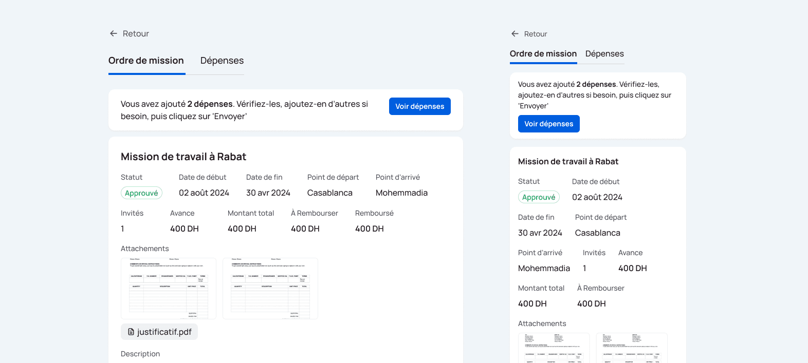
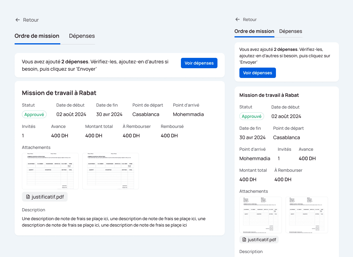
On the default Mission Order tab, we added a small banner:
“You have X expenses ready. Review & send them for HR approval.” with a primary CTA next to the message that links directly to the review-and-send step. (shown in the image below)
Result in follow-up tests: 100% task completion, no clarifying questions.
And how it ended?
65% drop in usability-related complaints
From 31m to 3m onboarding time per user
35% increase adoption rate
of financial features : Bill payments and salary advances.
60% to 90% task completion rate
27% uplift in onboarding client acquisition
107% increase in monthly active users
On top of that, we boosted our delivery speed by 50%, completing the work of two sprints in one. This efficiency allowed us to meet the project deadline successfully.
Brahim stood out for his autonomy, responsiveness, and attention to detail. His dedication and ability to quickly refine designs made him invaluable to our team. It was a pleasure working with him, and I have no doubt he will continue to excel.

Othmane BENNANI
Founder and CEO of Paylik
If time and scope were no object.
I would:
✦ Conduct a qualitative research with employees and HRs from various companies to gain insights about the needs & pain points.
✦ Implement heatmaps to analyze user interactions to assess the areas of confusion and frequency of features usage.
✦ Implement account creation flow from the website, and not manually by staff.
✦ Do more testing with different personas.


