Rethinking food delivery for employees
Scope
Mobile app
Web app
Branding
Role
Lead product & visual designer
Duration
5 weeks
Team
2 stakeholders, 1 developer, 1 designer
Overview
LunchPro is a lunch-only food delivery app created exclusively for Moroccan employees, partnering with carefully selected restaurants, LunchPro provides its customers high quality meals to help them refuel during their work breaks, ensuring diversity of choice, competitive prices, and lower delivery cost.
Live app: https://order.lunch.pro/
Disclaimer: This project was conducted in French and most of the screens and videos are in French language. If you need additional context, feel free to reach out.
Goals
The goal is to design a responsive web app, a mobile app (iOS & Android), and a staff web app, all working seamlessly together to ensure:
❋ Increase early product adoption by clearly communicating the value proposition
❋ Achieve at least a 70% task completion rate for placing an order
❋ Boost lunch order volume by 20% within the first 2 months
❋ Enable staff to manage 20+ simultaneous orders with minimal errors or delays
Problem
Moroccan employees often face a frustrating lunch experience with current food delivery apps due to inflated prices, limited food options, long wait times, and sometimes poor meal quality. As a result, they avoid experimenting with new restaurants, feel compelled to order the same meals, or skip ordering entirely. This mismatch between user needs and available offerings drives distrust, increases churn, and discourages adoption, creating a market gap for a reasonably priced, culturally relevant, quality-focused, and time-efficient lunch delivery service.
Collaboration
I collaborated primarily and closely with the product owner. We maintained alignment through daily check-ins via WhatsApp and weekly prototype reviews, which helped us stay on track with evolving priorities and business requirements. These sessions also included key stakeholders, whose feedback was especially valuable in refining the UI.
Given the limited direct communication with the developer at the time, I ensured a smooth asynchronous handoff by pairing my Figma files with clear documentation, outlining usage guidelines, interaction notes, and design specifications.
Coming soon
“I usually use Glovo when I’m too lazy to go out, when I have a busy workday, or a tight lunch break.”
Manal - Employee
Research
I ran both primary and secondary research but only for employees and not for staff, since staff will be trained to use the interface, and is not our focus for the first release (at least not compared to the employee) starting with the secondary, I did read reports and blogs and read the first 40–50 most recent Glovo reviews since Glovo is the most used app for food deliveries.
I started with secondary research and read industry reports and blog articles, and I also read through the first 40 to 50 most recent user reviews of Glovo, which is currently the most widely used food delivery app in Morocco. This helped uncover recurring frustrations, user expectations, and competitive gaps that informed the design direction.
Coming soon
Key findings:
✦ 25% of the population use food delivery apps
✦ Glovo is the most used food delivery app with 60% usage rate
✦ Lunch makes up 40% of orders, with an average order value of MAD130
✦ A few mentioned canceled orders after long wait times, causing frustration
✦ Extra service and delivery fees were often described as excessive.
✦ Some reviewers said delivery drivers refused to deliver to their door or falsified delivery attempts.
✦ In many companies and sectors, employees enjoy a 1-hour lunch break, especially in formal office environments.
With the given time constraint, I also talked to friends over the phone. They are office employees who regularly use food delivery apps. I wouldn’t call it well-prepared primary research, but it still provided valuable insights:
I usually use Glovo when I’m too lazy to go out, when I have a busy workday, or a tight lunch break.
I rarely order from new restaurants, but when I do, I ask my colleagues or check social media to see what people think of it.
I often feel frustrated during my lunch break when delivery drivers keep calling, either to ask for directions or to tell me to come outside to pick up my order
I dislike using Glovo because the prices are always slightly pumped up
Insights:
Users frequently mention inflated prices and extra service/delivery fees, especially on apps like Glovo.
Many users only try new places after seeing recommendations from colleagues or social media reviews.
Users report cold food, canceled orders, falsified delivery attempts, and drivers refusing door delivery.
Employees often have 1-hour lunch breaks, but many orders arrive late, sometimes exceeding that hour, causing stress or even order cancellation.
Users often feel stressed and frustrated when drivers repeatedly call, ask them to come outside, or struggle to find their location during their lunch break.
Users feel stuck ordering the same meals (sandwiches, tacos, pizzas), avoiding new restaurants due to lack of variety and trust issues with quality.
Users often order from Glovo as a last option, only when they are extremely busy or don’t feel like going out to nearby restaurant.
Problem refinement
After research and understanding the business modal, I realized that most of the core problems will be covered by operations and offline protocols: Inflated prices? Solved through daily discounts covered by employee companies and free deliveries. Lack of food variety? Addressed by curated meals from seasoned chefs. Inconsistent quality? Handled via an offline protocol that every restaurant must follow. Long delivery time? Partially resolved by the fact that drivers already know the company address, as employees will always receive food at the same registered workplace location.
So I asked: Where do I come in as a designer? What is my real impact? do I just need to put all of this in a Glovo-like app?
Yes, the internal staff app needs UX support for tracking and managing orders. But when it comes to the employee-facing app, am I just building another food delivery interface with different pricing and added traditional dishes?
That question led me to reframe the problem. It’s not just about what we’re offering, it’s how we deliver it. The real design challenge lies in translating these invisible operational promises into visible, believable, and frictionless user experiences (and that’s what the team expected from me too).
Refined problem areas:
1/ Users already have their lunch alternatives: Employees already have systems that work for them: homemade food, trusted nearby spots, or fast routines. When delivery feels expensive or offers the same uninspiring choices, they stick to what they know.
Related to sub-problem 1,2 and insight 1,2
2/ Users don’t want to learn a new app at lunch: Lunch is not the time to figure things out. If the experience isn’t instantly intuitive and familiar, users will likely abandon it.
Related to insight 4
3/ Time pressure & delivery friction: Lunch breaks are short, and time feels tight. Even if delivery is fast, vague updates and poor feedback loops create anxiety. Users need clear, real-time delivery visibility that reassures them without interrupting their workflow.
Related to sub-problem 3 and insight 4,5
4/ Lack of social proof is a lack of trust: Employees avoid new meals or vendors without trusted recommendations or visible ratings. Without that, they’ll stick to what they know or go for offline alternative.
Related to insight 2,6
5/ No support for habit formation: Even when the first order goes smoothly, users don’t automatically come back. In my primary research, several employees mentioned that they use delivery apps “only when I’m too busy” or “just for today.” This behavior reveals a one-time-use mindset rather than a recurring lunch habit. Therefore, the product risks becoming forgettable, used once and then abandoned.
Related to insight 7
Solution at glance
With most operational issues already addressed behind the scenes like pricing, food quality, and delivery logistics. My role as a designer was to turn those backend improvements into a visible, seamless, and delightful experience for employees. Below is a quick overview of how each refined UX problem was directly answered with focused, user-centered solutions:
1/ Make the value unmissable: Communicated the value early by leading with a benefit-driven onboarding flow, displaying the daily discount prominently, and showing meal prices both with and without the discount to reinforce perceived savings.
(Related to refined problem area 1)
2/ Familiarity and auto-filled address: Implemented auto-filled delivery address via company code, and applied familiar mental models and simplified the flow to reduce learning effort and make the app instantly usable.
(Related to refined problem area 2)
3/ Real user-friendly time tracker: Built a real-time, interactive tracker that visually shows delivery progress and removes uncertainty during short lunch breaks.
(Related to refined problem area 3)
4/ Rating system: Integrated a post-order rating system and surfaced peer feedback to build trust around unfamiliar vendors and meals. view detailed solution
(Related to refined problem area 4)
5/ Re-order and smart notifications: Introduced one-tap reordering and smart before-lunch-time reminders to encourage repeat use without adding complexity.
(Related to refined problem area 5)
6/ Designed to scale: Reduced visual load by showing only essential info, added filtering and sorting by order status/time, and proposed a list view and collapsible sidebar to optimize screen space.
(Related to refined problem area 6)
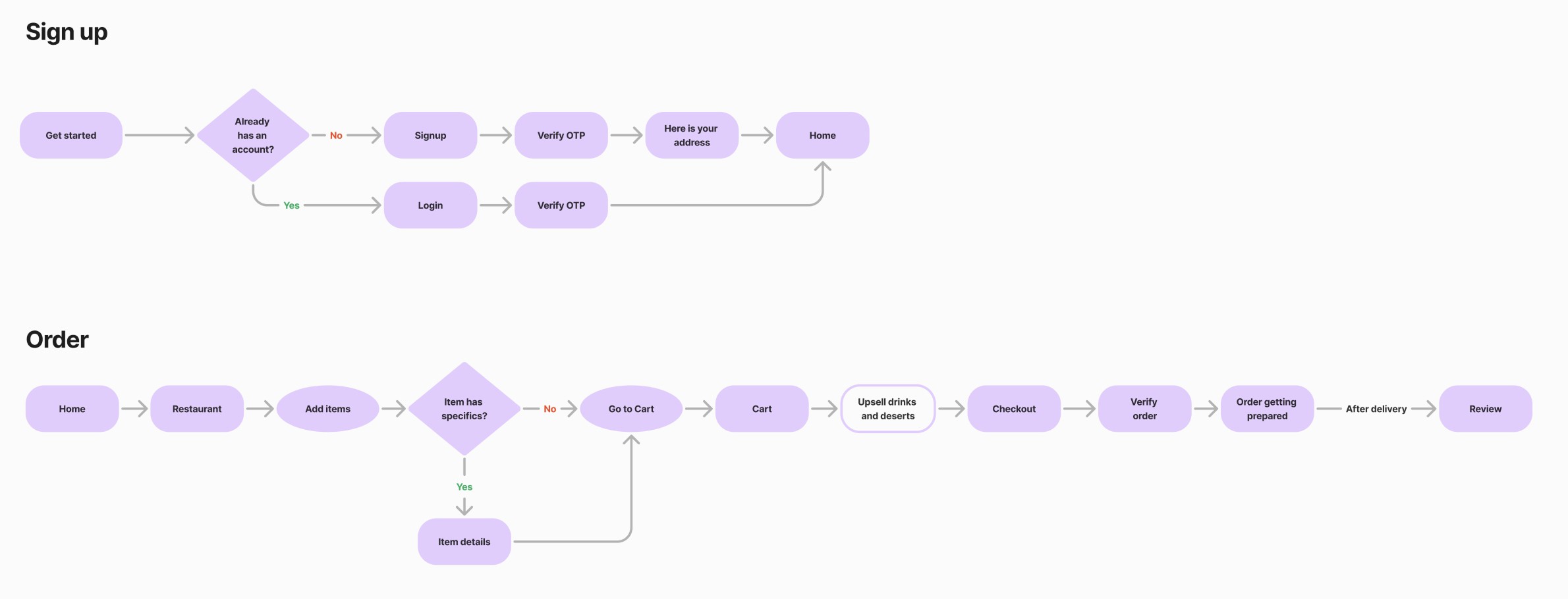
Ideation
As much as I craved fresh ideas, I had to ground them in what already works. That’s exactly what I did across the core experiences like browsing meals, placing an order, and tracking delivery. The sign-up flow was the only area where I intentionally broke away from standard patterns.
Applying Jakob’s Law wasn’t just a principle, it was the strategy. Since users are already familiar with apps like Glovo and UberEat, I chose to build on those mental models rather than reinvent them. I analyzed these platforms closely, especially Glovo, which dominates the food delivery space in Morocco, to extract existing flows and patterns.

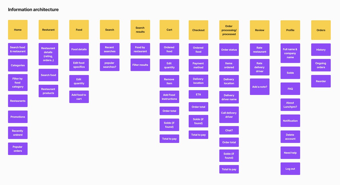
Given the time constraints and clear research signals, there was no need (or real value) in rethinking wireframes or building complete journey maps. Instead, I focused on the sign-up and ordering flows, and on information architecture that aligns with familiar navigation patterns:
To prepare for implementation, I synced with the team to anticipate needed features, like profile editing or meal descriptions, and organized them clearly within the IA board to align expectations early.
Design
1/ Make the value unmissable
For users to switch from their current lunch habits, the app needs to feel like a deal that’s worth it. The value proposition must be immediate, obvious, and emotionally rewarding. One of our strongest USPs was the daily discount sponsored by the user’s company, and I aimed to leverage that benefit to its full potential. Here’s how I approached it:
Informing immediately: As soon as users complete sign-up, they are greeted with a celebratory pop-up confirming their 20MAD daily discount using a fun, rewarding, and reassuring tone.
Keep the discount visible: Because the pop-up disappears after interaction, the discount is anchored in the top navigation bar, using a dedicated icon. This ensures it’s always in sight, helping users remember they have a valuable discount to use.
Reinforce it at decision points: On the food cards, and within each restaurant page, both the original and discounted prices are shown together. A purple discount icon draws attention to the price reduction.
Visual feedback after applying the discount: Once a user selects their first item, the discount icon updates visually on that item (highlighted in purple and changed to a checkmark), while all other discounted prices turn grey and inactive, clearly signaling that the discount has been used.

3.1 /3.2
Coming soon
2/ Familiarity and auto-filled address
Applied Jakob’s law throughout the core journey, from browsing meals to placing an order, so the experience feels intuitive even on first use. Primarily inspired by Glovo and Uber Eats, I leaned into design patterns users already trust such as navigation layout, food cards, CTA placements, and the checkout flow.
The goal was to make the unfamiliar feel familiar. While the app offers unique differences like daily discounts, free deliveries, and a workplace-based delivery address, I ensured these differences were integrated in a way that felt seamless and natural. By embedding new value within familiar structures, users could adopt the app without cognitive friction.
Food delivery apps are often loaded with unnecessary setup steps, especially when it comes to location entry. But in our case, we had a unique advantage: we already knew the user’s delivery address through their company code. Instead of asking the user to type or search for it, we take care of that step in the background, and we inform the user upfront during the onboarding with a friendly message : “Nice meeting you, {Employe name} Your delivery address will automatically be set to your workplace: {Company Address}”
3/ Real user-friendly time tracker
When it comes to lunch delivery, employees aren’t just hungry, they’re on the clock. In our research, time pressure and uncertainty around delivery timing were key sources of stress. To address this, I designed a real-time, visually interactive tracking experience that replaces vague messages with clarity and reassurance.
Each stage of the order, from confirmation to preparation, transit, and delivery, is displayed through an interactive progress bar, a clear title that updates accordingly, and supporting text that describes in detail what is happening. The bar updates in real time, and a looping animation creates a sense of active movement, reinforcing that progress is being made.
Coming soon
Coming soon
4/ Rating system
One of the key insights from user research was that employees are hesitant to try new meals or restaurants without some form of validation. Many said they rely on peer recommendations, colleague reviews, or Tiktok and Instagram before placing an order from a new vendor. This behavior made it clear that trust was not just nice-to-have, it was a prerequisite for exploration.
To address this, I proposed of a post-order rating system focused on delivery experience, food quality, and overall satisfaction.
Separately, I also explored the idea of allowing restaurants to optionally embed TikTok or Instagram review links within their page. This would add a social layer users already trust and actively seek out.
Unfortunately, the entire rating system was postponed to a later phase, so I didn’t design any screens for it during this iteration.
5/ Re-order and smart notifications
To achieve the retention and repeat customer goal, I explored ways to make reordering effortless and nudges feel natural. I introduced smart lunch-time notifications, sent only 30 to 60 minutes before the break. They’re light, relatable, and timed for when users start thinking about food.
I also designed a one-tap reorder feature, allowing users to quickly repeat past meals from their history, no browsing needed.
Both features help turn a one-time order into a habit, without adding complexity.
Coming soon
6/ Designed to scale
To support staff in managing anywhere from 1 to 20+ simultaneous orders, I started by identifying the essential elements of an order (such as the customer name, total price, and ordered items). This led to two views: a minimal view for quick scanning and a detailed view when needed. Since the minimal view would be used most often (especially during peak hours) it became the primary design focus. I explored the following solutions:
6.1/ Filters & sorting:
Staff can filter orders by status (e.g. new, in preparation, ready) or sort by creation time to better prioritize their queue.

6.2/ Collapsible sidebar:
Reducing sidebar width frees up space, allowing more orders to appear on screen at once.
6.3/ List view option:
A vertical layout makes it easier to scan a large number of orders quickly, especially in high-volume situations.
Logo, Brand voice & tone
Logo design
To me, one of the best things a designer can hear from a client is: "We don't have any restrictions, you have complete freedom to suggest fresh ideas". That is how I designed the logo, I completely detached from the old logo and its identity, treating the new logo as a start-from-scratch task.

I chose the letter 'L' as the foundation, and incorporated key elements that represent LunchPro: Companies (symbolized by a building) & Fast delivery (Tilted shapes)

Brand voice & tone
Before moving into UX fun, I took the opportunity to define LunchPro’s character using a Google researcher’s method. This helped craft a UX copy that resonates with the target audience and keeps them engaged. I've experimented with different tones through a few sample phrases, such as:
Empathetic : Lunchtime is here, and we know that feeling—you need something good, fast, and satisfying!
Exciting : Hunger won't wait!! neither should you! Let's get something delicious? 😋
Professional : LunchPro brings carefully curated meals straight to your workplace—fast, fresh, and hassle-free.

Making it pretty usable, and pretty
To ensure a smooth and fast development process, design consistency and time efficiency, I define all the required styles and components. Friendly, modern, and spacious were the key characteristics I kept in mind

Testing
We conducted usability studies with a small group of participants across both the Employee and Staff experiences. We measured four key usability metrics: Task completion rate, Time-on-task, Error rate, and NPS.
1/ Employee: The employee test covered the full ordering flow—from browsing meals to confirmation and delivery tracking.
Coming soon
Key improvements based on findings:
✦ Improved order validation feedback to reassure users after placing an order.
✦ Enhanced visibility of ongoing orders, making it easier to track deliveries.
✦ Renamed the status “New” to “Order Received” for clearer understanding.
Result: 100% task success rate for ordering with positive NPS.
2/ Staff: Staff testing focused on managing high order volumes efficiently. We noted that many staff used smaller tablets and struggled to navigate quickly.
Coming soon
Key improvements based on findings:
✦ Increased font sizes for order statuses to improve readability.
✦ Applied high-contrast backgrounds to status tags for faster visual scanning.
✦ Enlarged tappable areas and buttons to reduce errors and improve usability on smaller screens.
Result: Lower error rate and time-on-task.
Although the project just launched last 3 months, we are already seeing promising signs of success:
8 companies adopted LunchPro
+3500 orders & counting
+400 active users
0 usability complaints
Minimal feedback & Satisfied client
All deliverables have been technically sound, well-structured, and usable as-is by our development teams. He’s also shown strong creativity and initiative, often suggesting design solutions without needing constant input. He’s always delivered on time, which we value highly. He’s reliable, talented, and delivers real value.

Adil BEN EL KHATTAB
Founder

At this point, you probably deserve a snack break 🍫, so I’ll keep it brief. Here are few things I learned:
When working with hybrid apps (responsive web, iOS, and Android), even small changes to a card or component must be carefully considered, as adapting them to fit every device can be challenging.
Even seemingly minor UI changes, like renaming a status or resizing a button, can dramatically influence whether a user completes a task or abandons it. And the only way to catch these tweaks is through testing.
Next project?

Mobile app
Responsive web app