Helping store owners get started with inventory
Scope
Mobile app
Responsive web app
Role
Lead product & visual designer
Duration
10 weeks
Team
2 stakeholders, 1 developer, 1 designer
Overview
Stoky is a mobile-first inventory management app designed for small retailers in Morocco. While it promises simplicity, many users drop off before completing setup or using key features. I led a targeted redesign to improve onboarding and core features.
Disclaimer: This project was conducted in French and Arabic. Most of the screenshots are in French . If you need additional context, feel free to reach out.
Goals
❋ Increase store setup completion rate
❋ Reduce sales representative involvement
❋ Raise first-time usage of core features like selling and receiving stock
❋ At least 60% of onboarding completion without external help
While specific KPIs weren’t initially communicated, these targets helped guide the design decisions throughout the project.
Problem
Moroccan retailers abandon Stoky early because store-setup tasks are hard to finish, inventory value isn’t clear, and core features are difficult to use, driving high support load, half-configured stores, and low feature adoption.
Constraints
1/ Minimal-change:“The fewer changes we make, the better.” — project stakeholder.This limited me from making major changes to user flows, IA, or patterns, but it reduced development effort for the first release.
2/ Targeted redesign only:Scope was restricted to onboarding and core-feature screens, preventing us from redesigning the rest of the app.
3/ Solo-designer limit: Serving as the sole designer meant limited peer critique, but it let me iterate quickly and demonstrate ownership.
Trade-offs
We avoided major flow or IA changes to respect stakeholder concerns and limit development overhead. This preserved backend compatibility but restricted deeper UX improvements. We also postponed features knowing they could significantly boost engagement, in favor of shipping a simpler, stable release, and we haven’t conducted real-world user testing yet, which means some behavioral assumptions remain unvalidated.
Collaboration
To keep collaboration fast, the stakeholder and I used WhatsApp for quick feedback, committed to responding within 1-2 days, and scheduled meetings in Google Meet for workshops, prioritization, and open-ended discussions.

I collaborated with the developer asynchronously rather than in real-time chat. I first asked which CSS and icon libraries the product already used, I set a similar library in Figma, and created a changelog to track any iterations that could affect shipped screens. I also added inline notes for hovers, expandable elements, scroll behaviors, and more.
Abderrahmane - retailer
Research
When I first logged into the app, I immediately noticed many obvious UX issues: poor hierarchy, unclear copy, missing user feedback and more. so I decided to approach it with both user research and a UX audit. Starting with the audit:
1/ UX audit
I used Nielsen’s 10 usability principles as the audit baseline and layered in accessibility checks and a customer-journey review to identify where we might be losing users’ interest.

Key findings:
Lack of visibility into system status: After important tasks like “Add product,” a low-contrast toast appears, I even missed it during testing.
Error prevention: Vague labels and inputs in onboarding make it easy to misinterpret required data.
Accessibility: Some buttons have less than 16px of clickable areas and several text elements fall below the minimum contrast ratio.
Journey friction: Onboarding asks for too much information at once, including sensitive fields that feel intrusive for first-time users.
Visual clutter & inconsistency: One of onboarding screens is overloaded with text and icons, including irrelevant details. If users select Arabic or French, the verification email always arrives in English.
Note: I discovered many other usability and accessibility issues that are not mentioned here for brevity.
2/ User research
Fortunately, the team has already done some primary research. The sales representative spends a lot of time with retailers and knows their common pain points. I met the stakeholder in person and captured as many insights as possible. Here’s what they found:
✦ 9/10 users understand the importance and business value of inventory but don’t track it until accounting or legal requirements force them.
✦ Most users enter only the product name and leave the rest of the details blank.
✦ Over 90% don’t know their product quantities = they leave the quantity field blank.
✦ 100% of users do not understand what the negative stock numbers mean.
✦ Users add only the products that matter most to them, not their entire catalogue.
✦ Despite these challenges, existing users still see Stoky as the easiest inventory-tracking option available and continue to use it.
Key pain points:
There’s no urgency or immediate reward to motivate me to start tracking inventory.
Logging and tracking stock is time-consuming and frustrating.
I’m asked for product details and quantities I don’t actually know, so I abandon setup.
I don’t understand how to make a sell, add my products and manage my store.
I don’t care about tracking all products, I’m only interested in tracking products that I regularly lose tracking control of, or products that are critical/pricey.
Insights:
Users delay inventory tasks not due to lack of awareness, but because the process feels daunting and unrewarding.
Users abandon store setup because they lack the information the app assumes they have.
The onboarding flow is complex and relies too heavily on implicit learning, leading to abandonment or relying on sales reps.
The app’s core features aren’t self-explanatory, leading users to rely on sales reps.
Users will never track everything, they prioritize tracking only high-risk or high-value products that tend to slip through the cracks.
Despite the friction, existing users remain loyal because alternatives are even worse.
Although the existing research provided rich insights, I had also prepared a semi-structured interview script with 15 questions, intended for 4–5 participants. The goal was to dive deeper into specific pain points and better understand how users currently manage their stock. However, due to time constraints, we postponed this round of research to the next phase of product development. In retrospect, this was a strategic decision, it allowed us to focus on solving the most immediate issues first without overwhelming the process.
Problem refinement
At first glance, it might seem like a UX-only problem (and that’s what I assumed at first too), but after the research, it turns out that a big part of the problem is deeply behavioral and motivational.
Refined problem areas:
1/ Commitment gap: Retailers understand the importance of inventory tracking, but delay it. This procrastination stems from the task feeling very time-consuming and exhausting.
Related to: Sub-problem 2 and Sub-problem 4
2/ Lack of immediate value: Users don’t see a tangible or immediate benefit to logging stock. The system doesn’t motivate action through rewards or visible outcomes.
Related to: Sub-problem 2
3/ Cognitive overload: Onboarding feels like a long list of tasks. It’s asking for too much too early, filled with unclear copy, dense screens, and asks for sensitive info before building enough trust (such as ‘buying price’) leading to drop-offs.
Related to: Sub-problem 2
4/ Knowledge barrier: Many users don’t know their product quantities off-hand, and the app doesn’t provide flexible ways to handle this uncertainty.
Related to: Sub-problem 2
5/ Poor communication of logic: Negative numbers meant to indicate sales without stock confuse every user, because it goes against their expectations and mental models.
Related to: Sub-problem 2
6/ Usability wall: Most users depend on external help to understand basic flows. The current design doesn’t support intuitive learning or exploration.
Related to: Sub-problem 2
Solution at glance
Before jumping into pixels, I focused on solving the root causes of abandonment: high setup friction, unclear immediate value, and confusing core flows. Each solution was designed to remove blockers (both cognitive and emotional), simplify key actions, and help users feel early progress. Here are the solutions at a glance:
1/ Make it so easy you can’t say no: Users can start by adding 1, 3, 5, 10, or all products and postpone the rest. Smart product suggestions (based on industry) and daily/weekly nudges encourage gradual setup.
(Related to refined problem area 1)
2/ Demo Store and sales stats: Sample data of a demo store and sales statistics appear on first launch, showing payoff before full setup. Applied psychology and framing effects to strengthen the value impact.
(Related to refined problem area 2)
3/ Simplified and progressive onboarding: Removed unnecessary screens, added a progress bar, pushed sensitive and non-critical fields to later, trimmed and revised the copy, applied psychological principles, and delayed PIN setup.
(Related to refined problem area 3)
4/ Flexible quantity logging: When adding a product during onboarding, we ask: “Do you know the quantity?” before showing the quantity input. If not: mark the item ‘Missing Qty’, set a reminder option, and prompt again at each sale/operation of that product.
(Related to refined problem area 4)
5/ Clear stock indicators: Revisited the initial solution instead of tweaking it, and replaced negative numbers with a ‘Missing qty’ icon and added a dedicated Sold column.
(Related to refined problem area 5)
6/ Fix the obvious & add guidance: Introduced contextual banners and dismissible guides on every key features. All UI copy, structure, hierarchy, navigation, design patterns, interactivity, and accessibility issues were revised.
(Related to refined problem area 6)
Ideation
After uncovering the true blockers, it became clear that the issue is also behavioral resistance, and not only a messy UX. To tackle each problem area, especially the first two, I explored each possible solution using the HMW method, so I asked:
HMW make inventory tracking feel effortless to encourage commitment?
HMW show immediate benefit/reward of tracking their stock?
HMW allow users set up their inventory even when they don’t know products quantity?
HMW communicate sold items clearly?
I wrote the HMWs on sticky notes and placed them on my room’s window, every time I walked by to get a coffee, organize the room or watch a youtube video, I look at them and the questions re-surface and my brain gets a fresh angle. I found these outside-of-work-mode brainstorming sessions extremely helpful.

After two iterations of the onboarding flow, we ended up with the following:
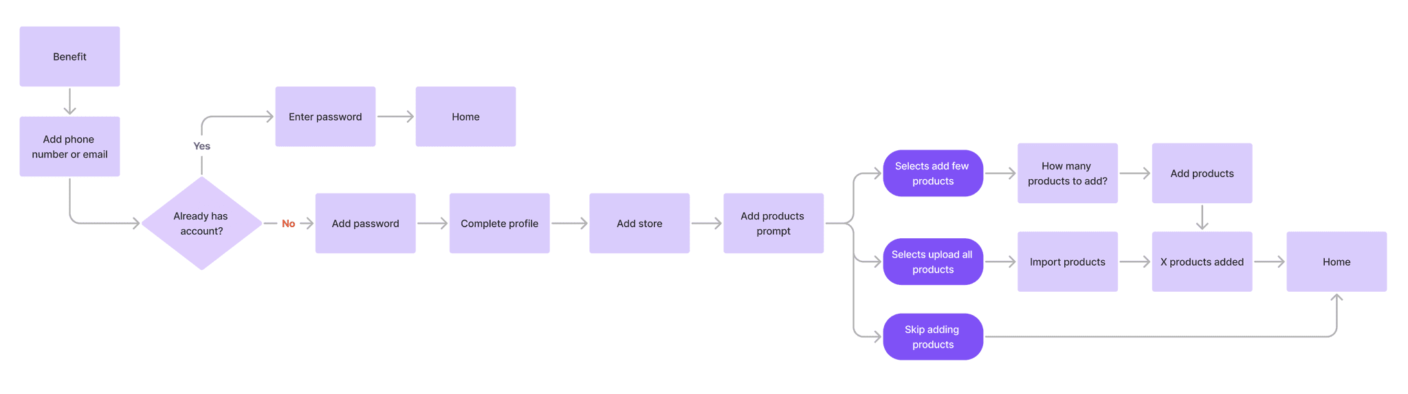
Design
I explored multiple solutions for each HMW, and shared them early with the team to ensure feasibility and alignment with requirements, we ended up choosing the following:
1/ Make it so easy you can’t say no
If we ask you to journal your entire last year right now, you’ll immediately resist or reject the idea, but if I ask you to only write 2 lines about yourself 1 week ago, its hard to say no, because its not a heavy task.
That’s the approach I adopted when asking first-time users to add their stock during the onboarding. Rather than asking to enter their entire product catalog with full details, we give the choice to start by adding only 1, 3, 5 or 10 products. And not just that, instead of asking for all product details (SKU, buying price, category, image, etc..) we only ask for the product name, selling price and quantity (if you have)
One way to help users add their stock is to turn the ‘add stock’ action into a habit. By breaking it down into a daily or weekly schedule and letting users choose how many products to add, they’re more likely to commit.
Another supporting way for quicker stock setup is smart suggestions. By asking users to select their business industry, the app can offer a list of relevant products that the retailer likely sells, making it easy to check off items and move on.
Unfortunately! the last two solutions were not included in the first release, so we decided to move forward with only the first solution.
Coming soon
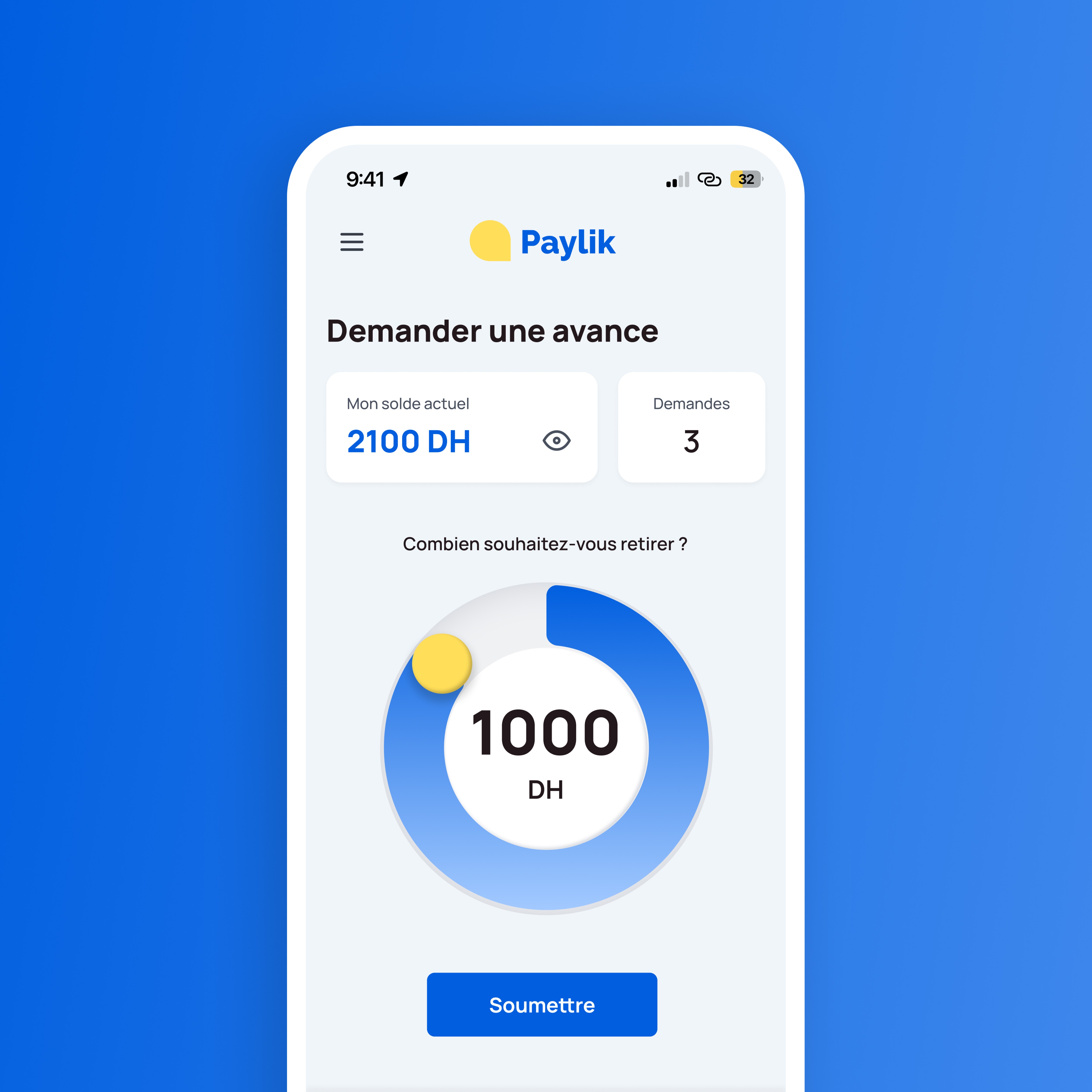
2/ Demo Store & sales stats
During the ‘Add Store’ step in onboarding, I introduced a demo store option for users who aren’t ready to add their actual store yet. The demo store loads instantly with 5 sample products, 2 sales, and 2 other transaction records, giving newcomers an immediate sense of Stoky’s value, without requiring any data entry or effort. To encourage switching to a real store, I added a banner on the home screen inviting users to set up their actual store and start logging real data. Some features in the demo version are intentionally locked to further motivate the transition.
We already had a statistics page, but it wasn’t designed to support day-to-day decision-making and lacked visual hierarchy, it was presented as a plain table which was not very useful or easy to read. So, I designed a short, relevant, and actionable statistics card on the home screen, showing monthly sales amount, number of sales added, products sold, and products received.
I designed a benefit screen to be the first thing users see when opening the app for the first time. Instead of showcasing features, I applied the Framing Effect to highlight the end value, showing how using Stoky can lead to better stock management, clearer tracking, and most importantly, more money in the pocket.
I also brainstormed the idea of showcasing real-world examples of similar retailers who increased their earnings and managed their stock more easily. However, due to time constraints, we weren’t able to bring this idea to life.
3/ Simplified and progressive onboarding
3.1/ Onboarding flow, copy and best practices
After syncing with the team, I simplified the flow by removing unnecessary screens and content and reworked all the copy. To boost completion rates, I added a progress bar to encourage users to complete the flow. I also removed all product detail inputs that aren’t essential or sensitive at this stage, asking only for the product name, selling price, and quantity.
But I didn’t stop there, I explored ways to make the process feel less daunting and more delightful. To do that, I applied the Endowment Effect, introducing a “Store Added” confirmation screen that includes the user’s actual store name, styled after real small businesses in Morocco. This helps users feel like they already own something in the app that relates to their actual store, building a sense of attachment from the very beginning.
3.1 /3.2
Coming soon
Coming soon
4/ Flexible quantity logging
Research has shown that over 90% of users don’t know their product quantities. When asked for this information during onboarding, it became a real blocker, especially since it wasn’t clear they could skip the step and add it later. To solve this, instead of immediately asking for a product quantity, we first ask users: “Do you know the quantity?” before even showing the quantity input. If not, we reassure them that it can be added later, show a reminder option via push notification, and mark the item as ‘Missing Qty’ in the system.
Knowing product quantities is critical for inventory, so I kept exploring ways to encourage adding them gradually. One of them is to prompt users to add the quantity of the products logged in a sale or inventory transaction during the success screen itself.
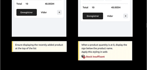
5/ Clear stock indicators
Previously, when the quantity wasn’t known, the system defaulted it to 0. After making a sale, it would then show –1 in the app. This was a real struggle for the team to explain, users didn’t understand that it meant “you sold one item,” and it still felt confusing even after explanation.
Instead of focusing on how to better communicate negative values, I took a step back and asked: “Is using negative values even a good solution to begin with?”
The new approach avoids showing any number at all when the quantity is unknown. Instead, we display ‘Missing Qty’ and find ways to encourage users to complete it later. We also dedicate a separate column to clearly show how much of each product has been sol
Coming soon
Coming soon
6/ Fix UX & Guidance
If we ask you to journal your entire last year right now, you’ll immediately resist or reject the idea, but if I ask you to only write 2 lines about yourself 1 week ago, its hard to say no, because its not a heavy task.
That’s the approach I adopted when asking first-time users to add their stock during the onboarding. Rather than asking to enter their entire product catalog with full details, we give the choice to start by adding only 1, 3, 5 or 10 products. And not just that, instead of asking for all product details (SKU, buying price, category, image, etc..) we only ask for the product name, selling price and quantity (if you have)
I used Figma to create mid-fidelity prototypes with instant transitions for team reviews and feedback, considering loading states, error cases, and a few smart animations.
Although the app is primarily designed for mobile users, we also ensured it looks good on desktop by providing responsive web designs alongside each mobile screen.
Coming soon
Coming soon
Coming soon
Coming soon
Visual design
UI design: We aimed for a minimal, trustworthy, and clean visual interface, one that fosters focus and clarity, no unnecessary content, decorative shapes or backgrounds. This is important since the audience is business-oriented and will be operating in a busy, often distracted environments.
Logo: Explored concepts that combined the letter “S” (for Stoky) with box shape (for inventory). Eventually, we opted for a much simpler and more abstract mark: a strong, outlined box. It’s immediately recognizable, scalable, and aligned with the app’s core value: Simplicity.
Design kit: Built a comprehensive UI kit with detailed documentation, fully aligned with the Angular-based design system already in use in prod. It includes +30 reusable components to ensure consistency across the product, while offering enough flexibility to adapt to edge cases and potential needs.
Colors: To match our brand personality, I kept the palette straightforward: black and grey form the base, while semantic colors (green, red, yellow, blue) are used strictly for contextual feedback like success, error, and info states.
Typography: Chose Ubuntu for its modern, rounded, and humanistic style. It maintains a professional tone, while being friendly and legible in small sizes. I established a clear hierarchy with 13 text styles that covers both web and mobile.
Animations: Customized and used lottie animations for delight, convey messages, and add a touch of liveliness to the app.
Coming soon
Coming soon
Coming soon
Validation
While the redesign is still in its pre-release phase, we conducted internal testing sessions with the team to validate the overall direction and uncover early usability issues. We focused on onboarding friction, demo store discoverability, and clarity around the missing quantity banner.
All team members were able to complete the key tasks, though many left optional product fields blank (as expected). We also tested with a store owner who instinctively explored the demo store first, validating its value as a safe starting point for hesitant users.
These insights led to several targeted improvements. First, we simplified the product creation flow by requiring only the product name during onboarding, while making quantity and price optional. We also removed the PIN creation step from onboarding, as it introduced unnecessary friction early on, and now introduce it later once users are more engaged.
As a result, we observed 100% task completion in internal sessions, a noticeable reduction in time to first action, and improved clarity for new users through the demo store experience.
Our next step is to validate the real-world impact by running in-person user testing sessions after launch, focusing on conversion from demo to real store and first-week engagement for new store users.
Results
The redesign is currently in development and set to launch soon. I’m looking forward to seeing how it performs in the real world and continuing to iterate based on user feedback.
Post-launch success will be measured through a few key metrics: onboarding completion without support (≥60%), store setup activation with at least one product added, usage of core features like “Sell” or “Receive” within the first week, conversion from demo store to real store setup, and product quantity logging within the first few weeks. These indicators will help validate both usability improvements and behavioral impact.
The results met our expectations fully and, in some cases, exceeded them. One of his greatest strengths is his ability to clearly understand requirements and get things right on the first try. In most cases, his initial proposals required minimal revisions, which speaks to both his creative alignment and design accuracy.

Adil BEN EL KHATTAB
Founder

If I had time
✦ Craft a full statistics page with date and product filters.
✦ Design and implement a daily or weekly schedule, allowing users to choose how many products to add.
✦ Identify common business sectors and add smart product catalog suggestions.
✦ Conduct the primary semi-structured research study (questionnaire already prepared).
✦ Run usability testing and iterate based on findings.
Next case study
Responsive web app